Use Case: Analyzing Content Output + Performance
An in-depth look at a key use case for RootNote involving an internationally-recognized brand.
The Short Of It
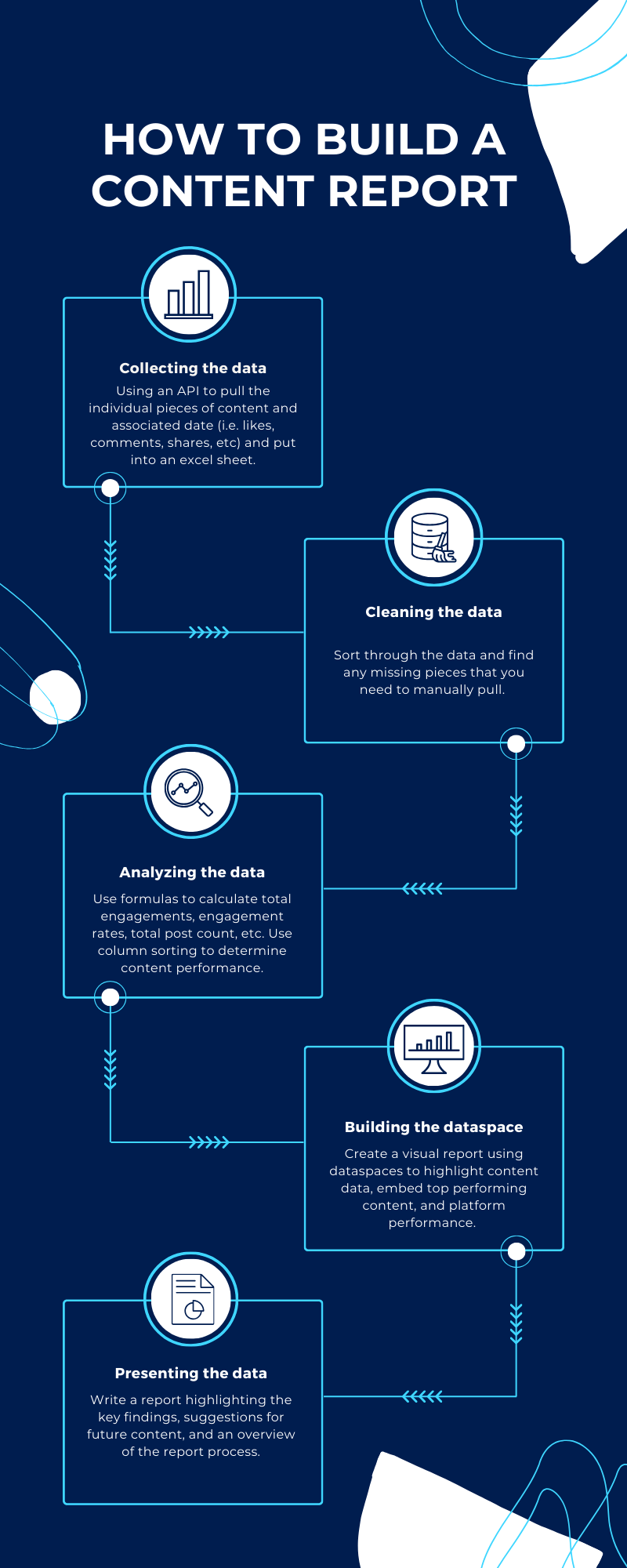
Gathering The Data
The first step is the most obvious one — but you've got to gather the data, using a combination of API connections and sometimes super-sleuthing to find what may be missing.
Find The Common Points
With all of these different platforms, you're likely not going to find the exact same information for each one. Which means you need to find common denominators and equivalent stats that can help you create a defensible but malleable universal picture.
Pretty Pictures Are More Fun To Look At
One of the reasons data is so hard for the "average" person to ingest is because it's often presented to us in really unflattering ways. By using Dataspaces, you can make complex information digestible and pretty to look at.

A Few Important Terms
So you're not like..."huh say what?"
A term referring to different accounts the client actually runs and operates, versus accounts that may be associated with the client but not actually controlled by them. For instance, a sports franchise has multiple "owned and operated" media entities, including their official social media handles, the handles of the mascot and other directly affiliated organizations, websites and offshoots related to merch, etc. However, they may also be interested in media properties that aren't "owned and operated" but still heavily associated with their brand — like the official social media accounts of players, fan clubs, and related organizations.
This is an acronym that stands for "application programming interface" but, uh, that's not really important. What is important is knowing that an API connection is the safest and most secure way for two platforms to communicate with each other. When it comes to RootNote, platforms that offer API connections allow a user to enter their credentials and automatically start pulling in certain data from that platform into RootNote. It's most common with social media platforms. The difficult thing about APIs is that not every platform has them, and they are almost always different, with some having lots of available data and others not.
Dataspaces are a flagship feature in RootNote. They are customizable and expandable canvases that allow you to bring in all kinds of data, content, and text in order to create custom reports, specialized media kits, and anything else you can imagine. They are also collaborative, which means you can work on them with other team members. And finally, you can share them with anybody — even if they don't have a RootNote account. In this use case, one member of the RootNote team was working independently in Dataspaces. Just imagine how powerful it can be when multiple members of the organization work together!
Overview
We recently completed a social media audit and analysis for a customer, looking at everything they posted for the year across their five owned and operated media channels. The social media platforms consisted of Instagram, X (Twitter), Facebook, YouTube, and TikTok. We then created Dataspaces for each owned channel highlighting top performing content for each platform. In addition, we looked at their entire athlete roster, calculating the total following across all platforms, and highlighted three players whose following is growing. We did the same for a group of influencers that the customer is either working with or is interested in working with.
Gathering The Data

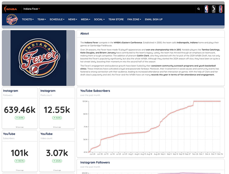
This is an example of a Dataspace for a professional sports franchise. While this data is considered "owned and operated" from the perspective of the team, it's actually coming in from publicly available sources (as opposed to an API connection).
Analyzing The Data
Once we had the data for the individual pieces of content for their owned and operated channels we were able to start analyzing it.
With owned posts on Instagram we totaled up the post count, likes, comments, shares, impressions, and video views. We also added up the total number of engagements per post (likes + comments + shares) and then divided by impressions/video views to find the engagement rates. We also took the number of posts that were paid partnerships and divided by the total post count to find the percent of paid posts. For the follower demographics we found the percentage of female, male, and unidentified followers by age group (13-17, 18-24, 25-34, 35-44, 45-54, 55-64, 65+), and the percent of followers that live in market vs. out of market based on the city they live in.
We also calculated the number of paid partnership posts for Facebook and Instagram for the main account. Additionally, we noticed across platforms that there was a lack of engagement in the comments from the accounts, so we recommend spending some time engaging each day as some were asking questions about where to find merch, etc. The additional engagement from the accounts also provides a human element that followers often like to see from brands. Of the more than two million estimated fans, only just over one million follow the primary Instagram account, leaving room to grow an additional million-plus in followers on just that account.

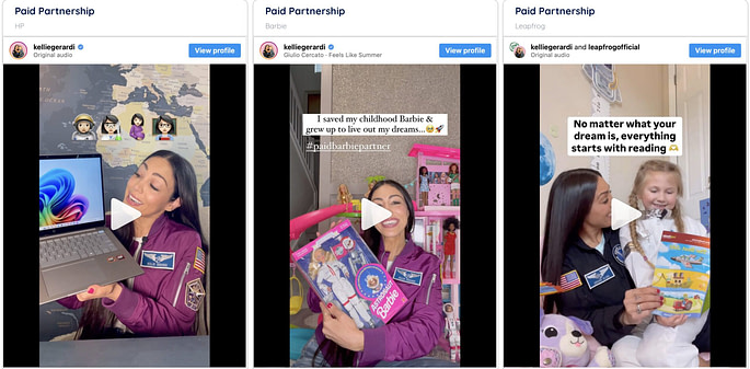
Highlighting paid partnership content creates an easy way to evaluate social performance metrics.
With the non-owned collab posts on Instagram we calculated the totals for post count, likes, comments, and video views. We then found the total engagements (likes + comments) and the average engagement per post (total engagements / post count).
For Twitter, we added up the totals for post count, views, likes, reposts, replies, and saves. We then added up the total engagements (likes + reposts + replies + saves) and divided by views to find the engagement rates.
With the Facebook data we totaled up the post count, reactions, comments, shares, impressions/video views, and total engagements (reactions + comments + shares), which we divided by impressions/video views to get the engagement rates. We took the number of posts that were paid partnerships and divided by the total post count to find the percent of paid posts. We also found the percent of followers that live in market vs. out of market based on the city they live in.
For YouTube we added the total number of videos, views, likes, comments, and total engagements (likes + comments), and the engagement rates (total engagements / views).
With TikTok we totaled up the post count, views, likes, comments, saves, shares, and total engagements (likes + comments + saves + shares). Dividing the total engagements by the views gave us the engagement rates.

When you connect certain apps to APIs, you can access deeper data, like demographic data.
Utilizing The All Creators Summary View
Once we had the data being pulled in we were able to create three different All Creators Summary views to share with the customer. The first view highlighted their owned and operated accounts, the second showed the following for their athletes, and the last was focused on the followings for the influencers they wanted to track.
Using these views we were able to find the top three growing athletes and three influencers that they should collaborate with based on their followings.

An example of an All Creators Summary page
Building The Dataspaces
Using Dataspaces we built a report for each owned channel that highlights each social media platform and the top content. For the athletes and influencers we created Dataspaces that highlighted the publicly available data for their social media platforms (followers, post counts, total likes, etc.), a text widget with a quick bio and information about top content, and embedded content that highlights other collaborations they have done.
For Instagram we included number widgets for followers and post count, line chart widget with followers, demographic widgets with followers by city, followers by country, and followers by gender/age, a text widget with the in market vs. out of market that we calculated, and an image widget that we used to upload the chart we created for the age/gender percentages. Using two more text widgets we added all of the post data that we calculated for owned posts and non-owned collab posts. For owned posts we used embed widgets to add the top three posts by total engagements, and the top posts by engagement rate, comments, and follows after engagement. For the non-owned collab posts we included the top three posts by total engagements, the top two for comments, and the top post for likes.
With Twitter we included a line chart with followers, number widgets with followers and a text widget highlighting the content data we calculated. Using embed widgets we added the top three posts by total engagements and the top posts for engagement rate, replies, and likes.
For Facebook we used number widgets and a line chart to add followers and page likes, demographic widgets to highlight followers by city and country, and text widgets to highlight in market vs. out of market followers, and content data. With the embed widgets we added the top three posts by total engagements, and the top posts by engagement rate, comments, and reactions.
With YouTube we used number widgets to add subscribers, video count, video views, average view percentage and average view duration. We used a line chart for subscribers and a demographics widget for viewer percentage by age/gender. A text widget was used to include the content data and we embedded the top three posts by total engagements, and the top posts by engagement rate, comments, and likes.
For TikTok we added number widgets for followers, total likes, and video count, and a line chart for followers. We used a text widget for the content data and embedded the top three posts by total engagements, and the top posts by engagement rate, comments, and likes.

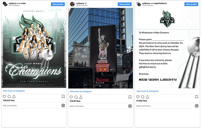
You can embed content in Dataspaces, allowing for an elegant approach to contextualizing data.

Multiple types of TikTok data visualized multiple ways.
Presenting The Findings
Once the Dataspaces were finished we provided the public links to the customer along with the CSV exports of the data from their owned and operated channels. With the data we were able to highlight the top performing content, which showed that collaborative posts with influencers and athletes performed better, and suggest a few players and influencers that they should collaborate with more to continue to grow their online presence. We were also able to provide an overview of their follower demographics by age/gender and in market vs. out of market. We also determined the number of paid partnerships posts on Facebook and Instagram for their main account. Another suggestion we provided was to reduce the number of posts and instead have someone spend some time each day responding to and interacting with comments.
